
Mahindra Finance
role
Lead UX designer
type
0-1 Enterprise Fintech, Android app

EY x Mahindra Finance (MMFSL)
Cut loan processing from 3 days to 30 minutes by digitizing workflows and unifying 6 fragmented tools into a transparent app
End-to-end Product Design & Strategy, UX research, Design System, Motion Design, Client Management
Android App · 2023-2024 · Team: 2 UX Designers (me+1), Design Manager, PM, Engineering, BRD

3days → 30mins
Application processing time
+54%
,
Applications processed per agent/day
-86%
,
Data entry errors
6 → 1
,
Systems Consolidated
OVERVIEW
Mahindra Finance is one of India's
largest vehicle finance companies
serving rural India
With 25,000 field agents processing thousands of loan applications daily across rural and semi-urban markets, even small inefficiencies compound into millions in delayed revenue. The company needed to modernize how agents work in the field.
The business goals were: Digitize the process to maximize business value and improve operational efficiency
Before

After
PROCESS
I shadowed field agents and mapped disjointed workflows to understand
how they actually worked in the field
20
Contextual Inquiries
03
As-Is Journey Mapping
20
User Intevriews
04
Competitive Analysis
Research
Insight
The system forced agents to adapt to the tool, not the other way around. Their tools were slowing them down, delaying loans.
Field agents were stuck juggling too many tools, calling managers for updates, and waiting days for simple loan offers. This is what they were dealing with:
Fragmented tol ecosystem
Agents switched between 6+ systems constantly, losing 45-60 minutes daily to context switching alone.
Zero application visibility
Agents used calls, WhatsApp, notebooks, and memory to manage their pipeline.
3-day offer turnaround
Basic filters helped narrow products, but did not explain which tree was right for a specific yard or climate.
Manual entry caused the biggest rework loop
Repeated typing triggered errors, rechecks, and delayed approvals.
How might we surface the right information at the right moment so shoppers can make confident purchase decisions without contacting support?
Balancing simplicity with complex constraints
Cross-team backend coordination
Must integrate with legacy systems
User diversity
Minimize training time for agents
Maintain compliance requirements
Before moving into design, I aligned with the
PM and stakeholders on our north star
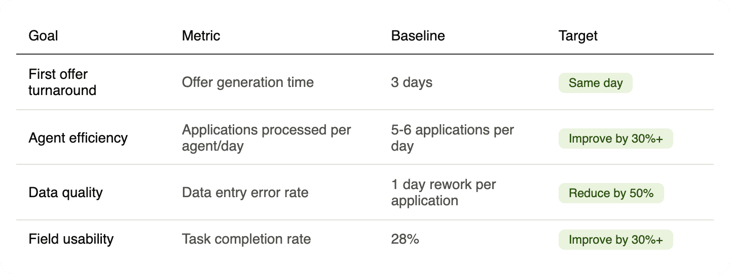
Design direction
To design a unified mobile workflow, so
agents could trust enough to stop working around.
01
Consolidate touchpoints
02
Eliminate redundant input
03
Design for status visibility
04
Reduce manual entry points time
Finding the right solution
Early explorations
Key Tradeoff
We optimized for the 80% common path and documented edge case fallbacks. Some manual overrides were preserved to handle exceptions.
The redesigned journey - From fragmented to a consolidated, guided flow
Experience that felt achievable on mobile and without cognitive load
Step 1
Consent
2 min
Step 2
KYC
5 min
Step 3
Sanction
15 min
Step 4
Post
5 min
Step 5
DO Issue
3 min
Total: ~30 min
Mobile-first
Real-time offers
The new experience allows users to get an offer in less than 30 minutes instead of 3 days.
FINAL SOLUTION
To design a unified mobile workflow, so
agents could trust enough to stop working around.
01/05
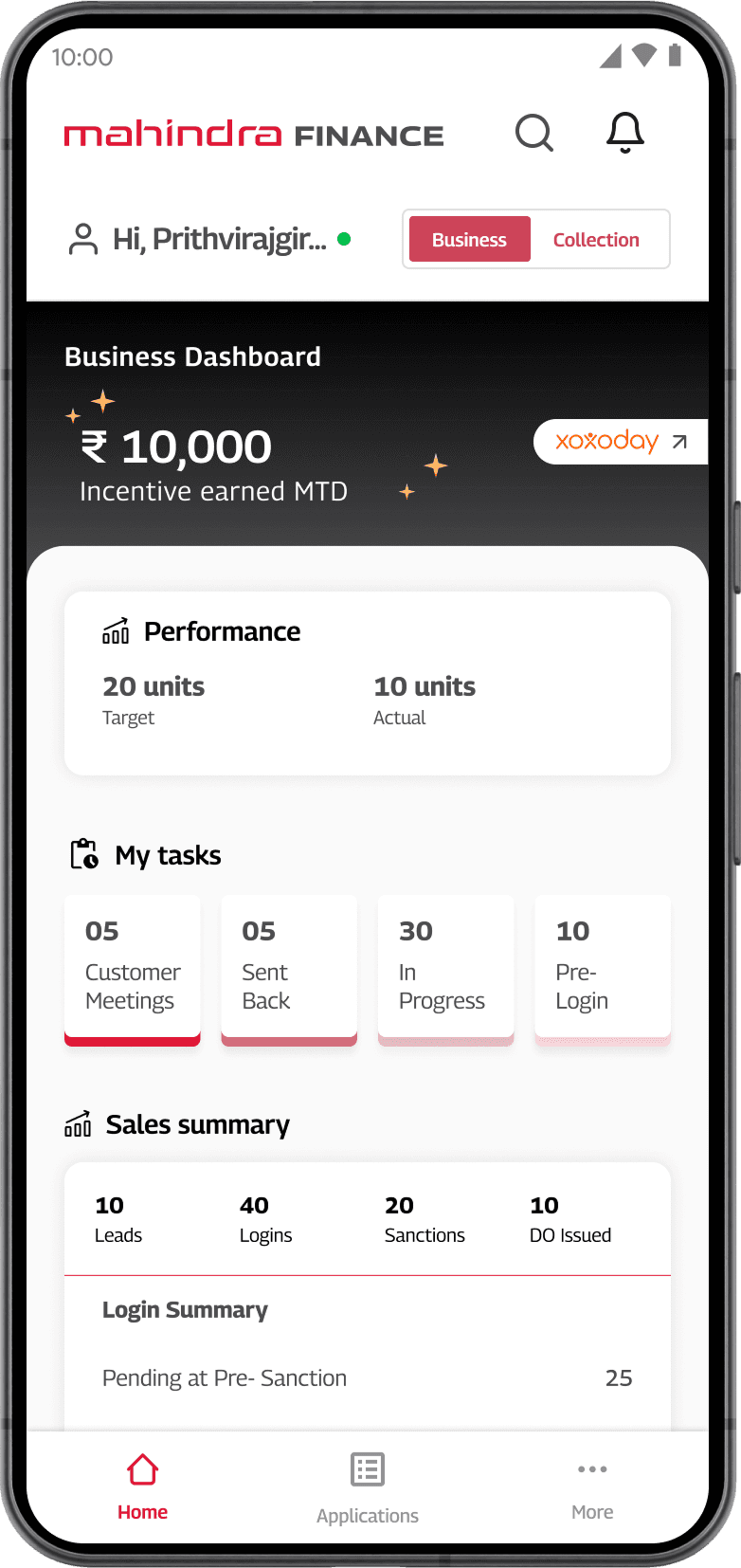
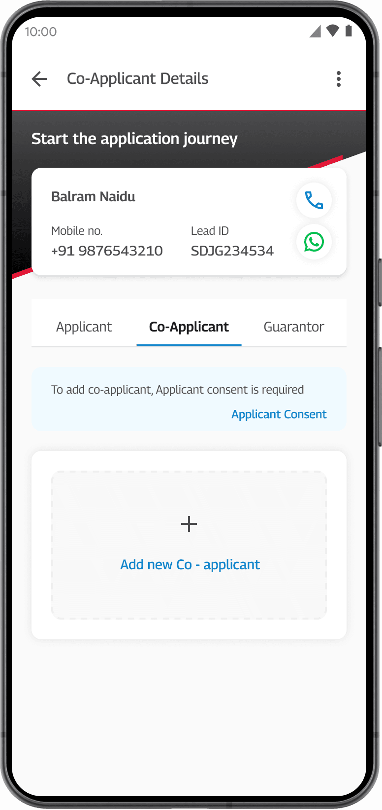
A unified experience, allowing entire application process in one place
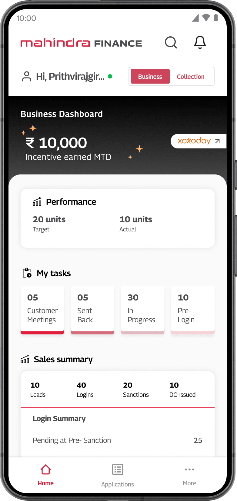
Tasks, documents, approvals, and application status — all in one place. Timestamped activity history, agents see where every application stands without calling anyone.

02/05
Progressive 5-stage form designed for mobile
Five clear stages. Vertical progressive disclosure. A visible tracker that tells agents exactly where they are and what's left.


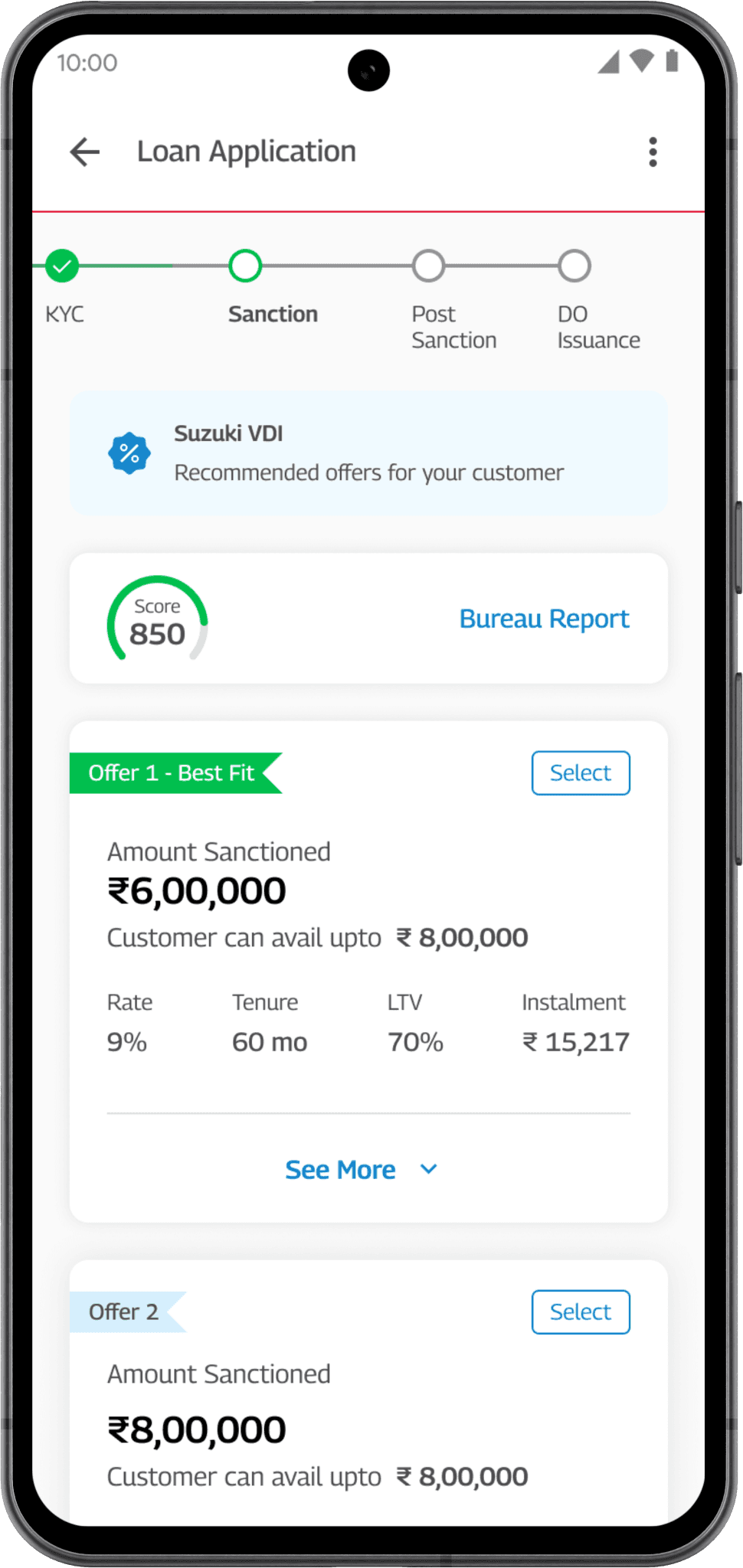
03/05
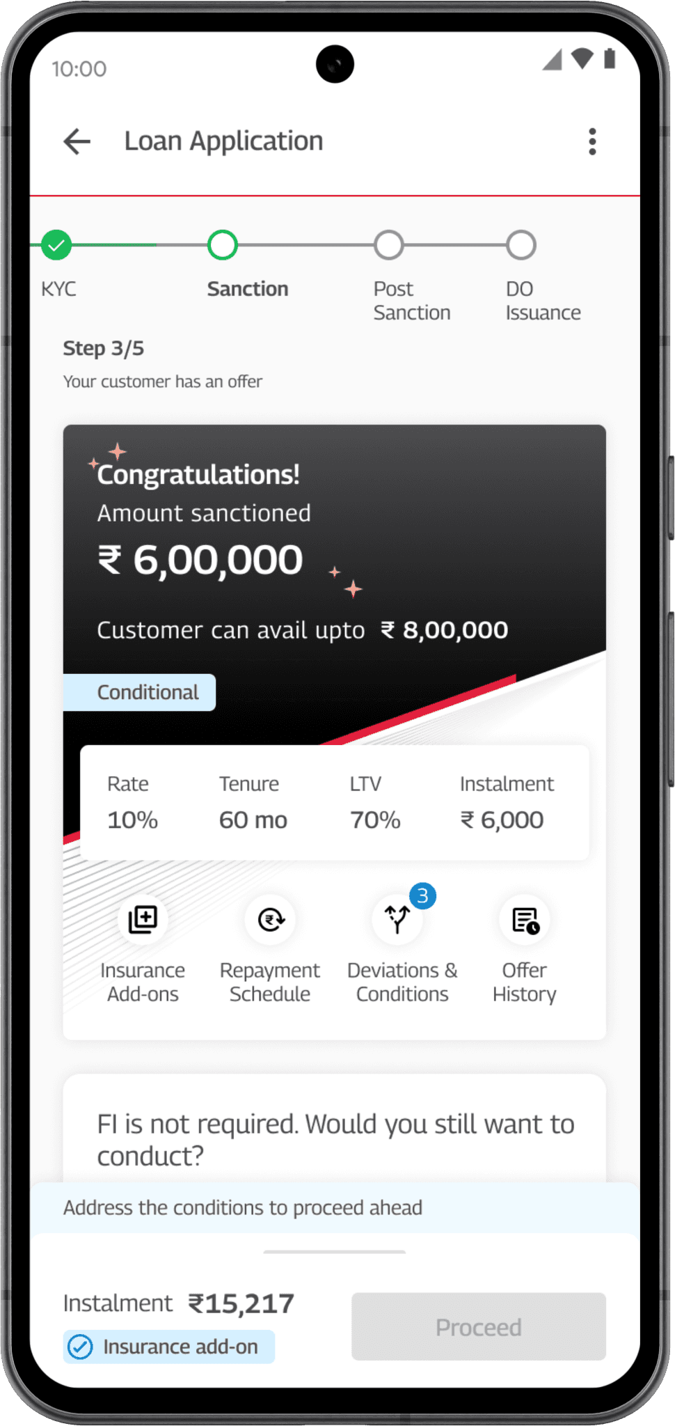
Accelerate offers
Eligible profiles can receive loan offers during the application session within 30 mins.

04/05
Digital KYC and E-signature for end-to-end paperless process
KYC, loan agreement signing, and mandate setup moved into the digital flow. Removed the paper dependencies from the workflow. Agents type less, reducing errors with manual data entry

05/05
Real-time status and next-step guidance
Agents see the status of every application in one place. Every application shows its current stage, what's pending, and the single next action the agent should take — in real time to reduce cognitive load.


Improved decision making for on the go agents with guided experience
Cues, labels, and in-context help throughout the form. Agents working in customer-facing environments don't have time to figure things out. The tool tells them what's needed, what's missing, and what comes next.



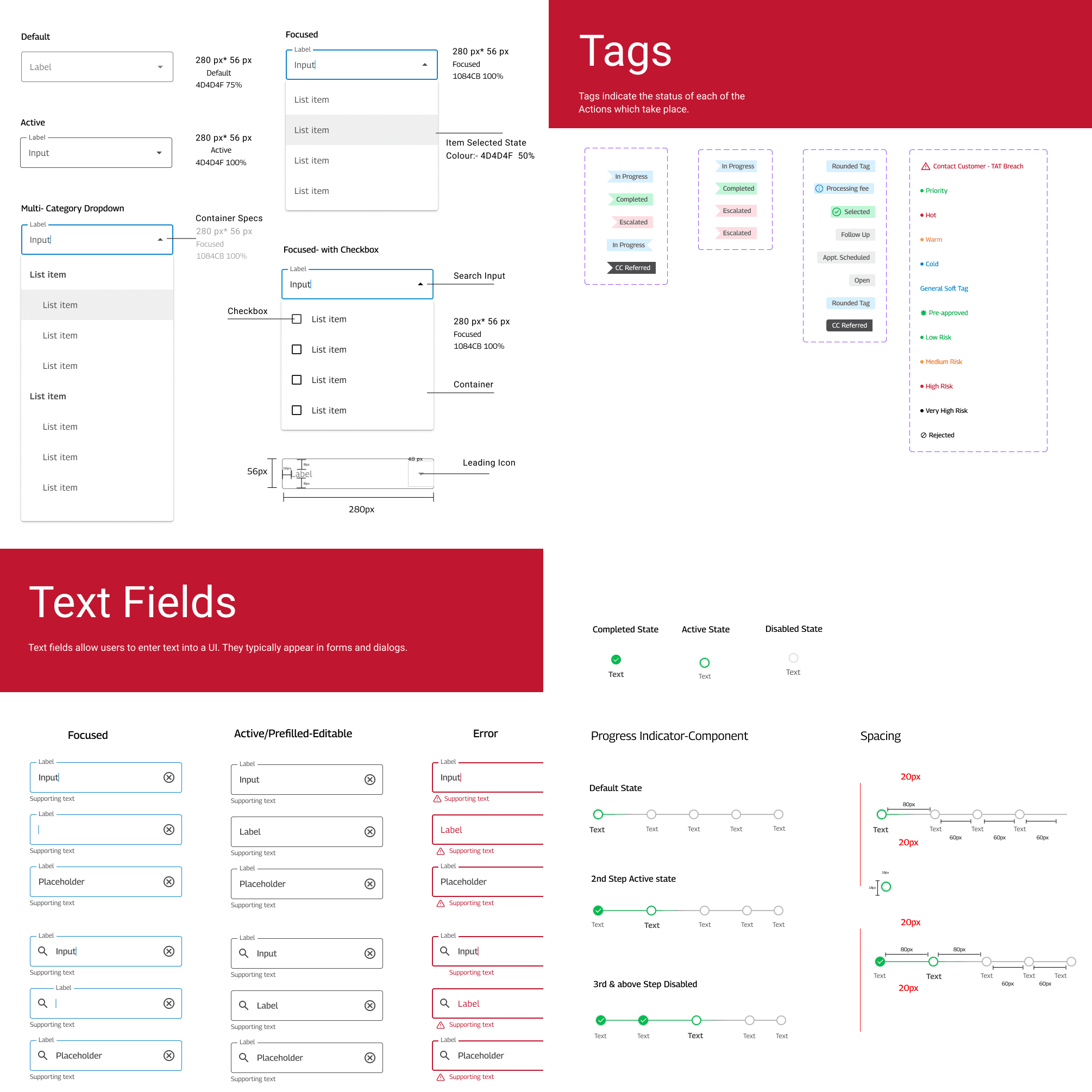
Designing in systems
Every component was built to be reused
across flows so the experience stays consistent
after
"I can see exactly where every application stands from the app. I don't need to call my manager anymore"
— Ravi, Field Agent, 32 · Usability Testing
KEY LEARNINGS
You're always designing two things:
the product, and the argument for the product
Field executives work in challenging conditions with poor network connectivity, bright sunlight, and time pressure demanded offline functionality, high contrast, and efficiency over aesthetic.
Shadowing field executives in their actual work environment revealed insights that would have been impossible to uncover through desk research
When stakeholders disagreed with a decision, usability data made those conversations easier. It moved the discussion from opinion to evidence.
I managed Anjali at EY on the Mahindra Finance project, where she was Lead UX Designer on a 0-to-1 enterprise fintech app. She led research from the ground up and translated that into a unified mobile experience.
Anjali has a rare ability to turn messy, high-stakes operational problems into clear, usable interfaces, and to bring stakeholders along with data rather than opinion. She also built the design system that kept the experience consistent as we scaled across flows, and she was someone I could put in front of the client directly. She'd be a strong addition to any product design team.

vriti WADHERA,